Thursday, April 22, 2010

Lab 4: GIS Data Models


Getting to know ArcGis was an interesting process. I've had a lot of experience working with Photoshop, so the concept of layers, vectors, and rasters was not unfamiliar. It was, however, difficult to learn all the processes and commands, and I'm not sure if I will remember them the next time I have to complete a lab assignment in ArcGis.

One pitfall of ArcGis is that it is hard for newcomers to use. There are a lot of processes to learn and it takes a while to et acquainted with the user interface, so anyone who wants to create a map would first have to learn how to use the program. Instead of doing that, most people would probably just use Google maps. I also had some trouble with the locations of my files. Since ArcGis uses databases, all my files have to be in the same place. At the beginning, I had to start over because one of my files was not in the right place and I couldn't find it. As I get more used to using Windows computers and ArcGis in this lab, I probably won't experience any similar difficulties. Finally, it takes a lot of time to produce something, which may restrict its capabilities in some situations.

However, once ArcGis is no longer a mystery, it can be a very powerful and precise tool for creating maps. I particularly liked how layers could be colored according to factors like populations density, just like the official-looking maps I've seen elsewhere. I liked how layers combine right on top of each other without having to move them around, resize them, and manipulate them to get them in the right position.

At the end of my first experience with ArcGis, I came up with a few questions and observations. I thought the sketch tool was interesting, and as I was drawing the new section of Airport Dr., I wondered if ArcGis is ever used in the real world to produce maps as a guide for construction of new roads. I also wondered how the concepts of triangulation and arc-node tables we learned about in class are incorporated into the program, and if we will ever need to work with them in lab.
Thursday, April 15, 2010

Lab 3 - Neogeography


View Lab 3: Coast trip in a larger map

Neogeography opens up geography to far more people. It is user-friendly and easy to create and view maps. People can take virtual trips by using software like Google Maps, allowing access to more places. Neogeography makes it easier and more fun to research things like hotels, restaurants, historic locations, and natural wonders of the world. People can express themselves through location of their trips, their home, their photos, their favorite restaurants, and anything else they wish. It opens up the world to anyone who wants to look.

There are some disadvantages, however. There is the issue of safety: having access to someone's personal location information could be dangerous. There can also be an information overload. For example, if you are looking at a certain landmark in Google Earth, like the Eiffel Tower, hundreds of little place markers will pop up. Some of them offer interesting information about the Eiffel Tower, but many are just people writing comments or posting just to get their name out there. It isn't always a good thing to allow access to world maps to everyone.

Thursday, April 8, 2010

Lab 2 - Topographical Maps

1. What is the name of the quadrangle?
It's called the Beverly Hills Quadrangle.

2. What are the names of the adjacent quadrangles?
The surrounding quadrangles are Canoga Park, Van Nuys, Burbank, Topanga, Venice, and Inglewood.

3. When was the quadrangle first created?
In 1966.

4. What datum was used to create your map?
The National Geodetic Vertical Datum of 1929 and the North American Datum of 1927.

5. What is the scale of the map?
1:24,000

6. At the above scale, answer the following:
a) 5 centimeters on the map is equivalent to how many meters on the ground?
1,200 meters.

b) 5 inches on the map is equivalent to how many miles on the ground?
22.7 miles.

c) one mile on the ground is equivalent to how many inches on the map?
0.22 inches.

d) three kilometers on the ground is equivalent to how many centimeters on the map?
12.5 centimeters.

7. What is the contour interval on your map?
20 feet with supplemental contours every 10 feet.

8. What are the approximate geographic coordinates in both degrees/minutes/seconds and decimal degrees of:
a) the Public Affairs Building;
118 degrees, 26 minutes, 0 seconds west and 34 degrees, 3 minutes, 30 seconds north
118.43 degrees west, 34.05833 degrees north

b) the tip of Santa Monica pier;
118 degrees, 29 minutes, 50 seconds west and 34 degrees, 20 seconds north
118.49722 degrees west, 34.00556 degrees north

c) the Upper Franklin Canyon Reservoir;
118 degrees, 24 minutes, 30 seconds west and 34 degrees, 5 minutes, 15 seconds north
118.41667 degrees west, 34.0875 degrees west

9. What is the approximate elevation in both feet and meters of:
a) Greystone Mansion (in Greystone Park);
620 ft.
188.976 m

b) Woodlawn Cemetery;
140 ft.
42.672 m

c) Crestwood Hills Park;
760 ft.
231.648 m

10. What is the UTM zone of the map?
Zone 11.

11. What are the UTM coordinates for the lower left corner of your map?
362500 E, 3762990 N

12. How many square meters are contained within each cell (square) of the UTM gridlines?
1,000,000 square meters.

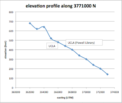
13. Obtain elevation measurements, from west to east along the UTM northing 3771000, where the eastings of the UTM grid intersect the northing. Create an elevation profile using these measurements in Excel (hint: create a line chart). Figure out how to label the elevation values to the two measurements on campus. Insert your elevation profile as a graphic in your blog.


14. What is the magnetic declination of the map?
14 degrees east.

15. In which direction does water flow in the intermittent stream between the 405 freeway and Stone Canyon Reservoir?
South.

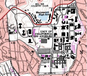
16. Crop out (i.e., cut and paste) UCLA from the map and include it as a graphic on your blog.

Thursday, April 1, 2010

Week 1 - 3 maps from the web


1. This map of the ocean floor in Monterey Bay came from an online news article from UC Berkeley describing the new seismometer placed in the underwater canyon. The map shows the coast near Monterey Bay, including the San Andreas Fault, some mountains, and the cities of Santa Cruz and Monterey. The map also shows the Pacific Ocean, in which the San Gregorio Fault is located and red circles, which probably represent past earthquakes. The new seismometer was probably placed there to measure the activity of these two faults. Finally, the map depicts the deep, close-to-shore underwater canyon. I thought this was an interesting map because it shows the structure of the ocean floor and also because it displays seismic data.


2. This map comes from the website of a Cornell University English class. It is a map of Mount Everest and other surrounding peaks. It is an interesting map because it shows not only topographic lines but also a detailed and realistic 3D representation of the mountains from above, complete with shadows and snow.


3. This map comes from the L.A. Times, but was posted on an Adobe website teaching people how to use Adobe Flash. It shows the location, cause, and race of homicide victims in Los Angeles County in 2007. It also shows small graphs to the side of the ages and dates of the murders. I think this map is interesting because it allowed me to find out that a vast majority of murders are from gunshot, are clustered in one main area, and have a high percentage of Hispanic victims.