Thursday, June 3, 2010

Mapping the 2000 Census

Note: click on figures to see them larger and in greater detail.

The following map shows the percentage of Asian people by county, as determined by the 2000 Census survey. Several trends are apparent in this graph. Major metropolitan areas appear to have the densest Asian population, especially those in coastal areas. The San Francisco Bay area has the highest population of Asians in the country.


The next map shows the percentage of Black people by county, also from 2000 Census data. An obvious trend is the high black population of the southern U.S. Some counties in this region have over 80% black people. Some counties with large area in the western U.S. have a somewhat high black population, but it would be interesting to see how this map would change if these large counties were divided into smaller areas. This would increase understanding of the distribution of blacks in the western U.S.


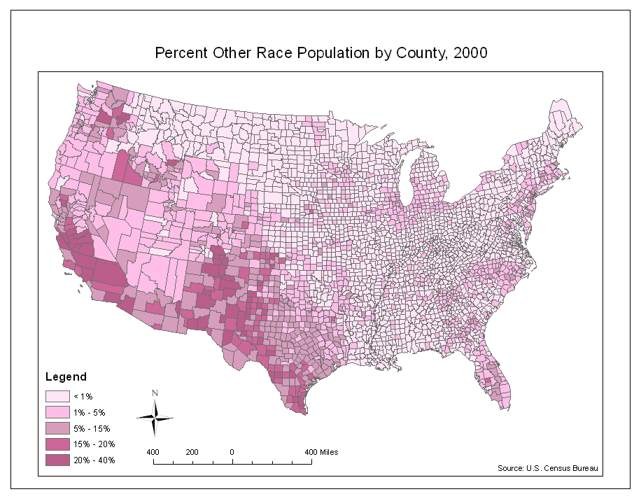
This map shows the percentage of people of some other race by county, also determined by the 2000 Census. These people could be any race not listed on a Census form. Races listed on the 2000 Census forms are: White, Black, Asian, American Indian, Alaska Native, Pacific Islander, and Native Hawaiian. People can choose "some other race" on their Census form if they think they fall into another category. This map shows that the highest concentration of people of other races is found in the Western United States: California, New Mexico, Texas, Washington, and Arizona. This may be because these areas have a high Hispanic population, and Hispanic is not a racial option on Census forms. Although information about Hispanic descent can be provided as part of a different question, some people choose to write it in under the "other race" category.


Creating maps like these three from raw Census data is very important because people trained to use GIS can take an extremely long list of numbers, which would probably be uninterpretable to most people and turn it into a map that can be easily read and interpreted. The data is then more accessible and can be used for many different applications. In creating these Census maps, I paid careful attention to the cartographical technicalities such as color and creation of breaks. With improper use of color and numbers, the map becomes less useful and doesn't serve its intended purpose.

I found ArcGIS to be fun to use. Each week in lab, I looked forward to seeing what function we would learn to do in ArcGis. There are so many different potential uses of the program and I feel like this class only explored a few of them.

Wednesday, May 26, 2010

Station Fire Report

This image shows an animation of the Station Fire as it grew from the early hours of August 29, 2009 to the morning of September 2, 2009. The light gray lines represent roads and trails. The color of the burning area becomes wider to show the progression of time.
create avatar


This image shows how the size of the Station Fire changed dramatically from August 29 to September 2, 2009.


This graph tracks how the acreage of the fire increased from August 29th to September 2nd.


The spread of the wildfire was intensified due to the extremely mountainous terrain. Almost every part of the affected area had a slope of over 80%, as shown by the following image.


The Station Fire was the largest fire ever recorded in the Angeles National Forest and the 10th largest fire recorded in California since 1933 (InciWeb 2009). started on August 26th, 2009 and burned more than 250 square miles in the San Gabriel Mountains, and was not fully contained until October 16th, 2009 (Inciweb 2009). Fire experts determined that the fire was most likely started by arson, and caused the deaths of two firefighters and the injury of 22 people (InciWeb 2009). Fire personnel were blamed for not controlling the fire more effectively when it was first lit (KPCC Wire Services 2010).

The three things needed for fire to burn are oxygen, fire, and fuel (SmokeyBear.com 2010). The Station Fire was fueled by fallen pine needles and branches and living pine trees of the Angeles National Forest (InciWeb 2009). Fuel is abundant in California due to the region's steep terrain and rainfall patterns: more rain falls in the spring and increases vegetation growth, but summer brings heat and dryness and much of the spring growth dies and becomes dry and very flammable (Wikipedia 2010). When no fire has burned out an area for many years, fuel builds up and makes it very easy for a fire to spread out of control even if winds are not strong (Wikipedia 2010).

Although it burned largely in the Angeles National Forest, where population density is low, the Station Fire still did a lot of damage to residential and commercial areas. By August 30th, it had already destroyed 18 homes, many deep in the forest, and posed a significant threat to 10,000 more homes, 500 business structures, and 2,000 other buildings (CBS News 2009). One such building threatened by the Station Fire was the Mount Wilson Observatory, where there are many telescopes and 22 communications towers (Lakdawalla 2009). Two firefighters were killed as they tried to escape the flames and their truck drove off a cliff (CBS News 2009). The fire grew dramatically quickly, especially to the north, and was not even encouraged by Santa Ana winds (CBS News 2009).

In addition to the injury, death, and destruction, the Station Fire had many other ill effects. It made air quality intolerable in the surrounding communities of La CaƱada Flintridge, Altadena, La Crescenta, and Pasadena (Lakdawalla 2009). Mudslides can occur after fires wipe out the vegetation that normally keeps the soil in place. The rains that follow can loosen soil enough to create massive mudslides that can rip homes from their foundation, so residents of areas affected by the Station Fire worked hard to create barriers that would protect their homes from mudslides (Zavis 2009). The San Gabriel Mountains are particularly susceptible to mudslides because they are made up of brittle, crumbly rocks (Zavis 2009). A mudslide ended up destroying over 40 homes in La Canada Flintridge (KPCC Wire Services 2010).

Although fires like this one are very destructive, they play an important role in maintaining the balance of ecosystems. The number of wildfires in Southern California has increased due to human influence, but periodic natural burning has many benefits. Fire removes excessive plant growth and makes room for new plants to grow (Long 2009). Fires also release nutrients into the soil, encouraging the growth of new plants (Long 2009). Fire experts are working to rehabilitate the area burned by the Station Fire (InciWeb 2009).

References:
Author, A. A., & Author, B. B. (Date of publication). Title of document. Retrieved from http://Web address

CBS2 News. (30 August 2009). 2 Firefighters Killed As Station Fire Grows. Retrieved from http://cbs2.com/local/Fire.Watch.Angeles.2.1152524.html

InciWeb: the Incident Information System. (10 November 2009). Station Fire. Retrieved from http://www.inciweb.org/incident/1856/

Knoll, Corina & Zavis, Alexandra. (17 September 2009). After the Station fire, a new danger: mudslides. Retrieved from http://articles.latimes.com/2009/sep/17/local/me-sandbags17

KPCC Wire Services. (6 February 2010). Evacuation orders lifted for mudslide residents as clean-up effort gets underway. Retrieved from http://www.scpr.org/news/2010/02/06/heavy-rains-trigger-mudslides-station-burn-areas/

Lakdawalla, Emily. (31 August 2009). Station Fire update: Mount Wilson Observatory still there, but still under threat. Retrieved from http://www.planetary.org/blog/article/00002074/

Long, Alan J. (2009). Benefits of Prescribed Burning. Retrieved from http://edis.ifas.ufl.edu/fr061

Wikipedia, the free encyclopedia. (27 May 2010). 2009 California Wildfires. Retrieved from http://en.wikipedia.org/wiki/2009_California_wildfires

Tuesday, May 18, 2010

DEMs in ArcGis

The area I selected is in the Sierra Nevada mountains in eastern California, near Highway 395. The boundaries of this map are 35.86 degrees north to 36.46 degrees north and 117.62 degrees west to 116.75 degrees west. Visible in this particular map are several mountain ranges spanning from north to south with valleys between them. The scale of this map is 1:399,008.

This map shows a shaded relief of the area.


This map shows the varying slopes of the area defined by different colors. Green signifies a flat slope, while dark red signifies the most extreme slope.


This map shows the aspect, which is the direction the land faces. Gray is flat, red is north, yellow is east, turquoise is south, and blue is west.


The following three maps show 3-dimensional views of the area from different angles.


Monday, May 10, 2010

Lab 5: Map Projections with ArcGis


Every map projection is going to distort the earth in some way or another, but knowing which one to use in different situations is important. To determine this, it is important to look at the distortion of the 30˚ x 30˚ graticule, the distortion of the land masses, and the changing distances. It might be interesting to note that the actual distance between Kabul and Washington, DC is 6,930 miles.

The sinusoidal projection looks somewhat spherical, so the observer might think of a globe when looking at it. It is equal area, so the sizes of land masses are not distorted much except at the poles. It appears to be most accurate near the equator, but distances are greatly stretched. The Mercator projection also seems to be most accurate at the equator, but instead of being squeezed at the poles like the sinusoidal projection, it is vertically stretched, so Antarctica looks larger than all the other land masses put together, and Greenland looks larger than South America. It is obvious that the most northern and most southern 30˚ x 30˚ squares are greatly distorted because they are so much longer than all the others.

The Gall stereographic projection appears to display the land masses without much distortion, but it is important to note that vertical distances are somewhat exaggerated. This can be determined by looking at the shape of the graticules. This projection also has more distortion, but this is not as pronounced as it is in the Mercator projection.

It is interesting to compare the differences between the two types of cylindrical projection. The equidistant cylindrical projection stretches the image of the earth vertically, and the equal area cylindrical projection stretches it horizontally. The equidistant cylindrical projection provides, by far, the closest estimate of the distance between Washington, DC and Kabul. It would be interesting to see if the distance from one city to another city directly to the south would be as accurate, since this projection seems to distort north-south coordinates a lot. The equal area cylindrical projection flattens the image of the earth at the poles.

The conic projection presents a completely different shape of map. It seems to be an accurate view of the earth from above, with distances between longitude lines zero at the poles and increasing towards the equator, but there is one problem: Antarctica appears to be about 50,000 miles long. This is because the distance between longitude lines doesn't decrease towards the south pole. If an accurate view of Antarctica was needed, this projection could view the earth from above the south pole instead of the north pole.

Thursday, April 22, 2010

Lab 4: GIS Data Models


Getting to know ArcGis was an interesting process. I've had a lot of experience working with Photoshop, so the concept of layers, vectors, and rasters was not unfamiliar. It was, however, difficult to learn all the processes and commands, and I'm not sure if I will remember them the next time I have to complete a lab assignment in ArcGis.

One pitfall of ArcGis is that it is hard for newcomers to use. There are a lot of processes to learn and it takes a while to et acquainted with the user interface, so anyone who wants to create a map would first have to learn how to use the program. Instead of doing that, most people would probably just use Google maps. I also had some trouble with the locations of my files. Since ArcGis uses databases, all my files have to be in the same place. At the beginning, I had to start over because one of my files was not in the right place and I couldn't find it. As I get more used to using Windows computers and ArcGis in this lab, I probably won't experience any similar difficulties. Finally, it takes a lot of time to produce something, which may restrict its capabilities in some situations.

However, once ArcGis is no longer a mystery, it can be a very powerful and precise tool for creating maps. I particularly liked how layers could be colored according to factors like populations density, just like the official-looking maps I've seen elsewhere. I liked how layers combine right on top of each other without having to move them around, resize them, and manipulate them to get them in the right position.

At the end of my first experience with ArcGis, I came up with a few questions and observations. I thought the sketch tool was interesting, and as I was drawing the new section of Airport Dr., I wondered if ArcGis is ever used in the real world to produce maps as a guide for construction of new roads. I also wondered how the concepts of triangulation and arc-node tables we learned about in class are incorporated into the program, and if we will ever need to work with them in lab.

Thursday, April 15, 2010

Lab 3 - Neogeography


View Lab 3: Coast trip in a larger map

Neogeography opens up geography to far more people. It is user-friendly and easy to create and view maps. People can take virtual trips by using software like Google Maps, allowing access to more places. Neogeography makes it easier and more fun to research things like hotels, restaurants, historic locations, and natural wonders of the world. People can express themselves through location of their trips, their home, their photos, their favorite restaurants, and anything else they wish. It opens up the world to anyone who wants to look.

There are some disadvantages, however. There is the issue of safety: having access to someone's personal location information could be dangerous. There can also be an information overload. For example, if you are looking at a certain landmark in Google Earth, like the Eiffel Tower, hundreds of little place markers will pop up. Some of them offer interesting information about the Eiffel Tower, but many are just people writing comments or posting just to get their name out there. It isn't always a good thing to allow access to world maps to everyone.

Thursday, April 8, 2010

Lab 2 - Topographical Maps

1. What is the name of the quadrangle?
It's called the Beverly Hills Quadrangle.

2. What are the names of the adjacent quadrangles?
The surrounding quadrangles are Canoga Park, Van Nuys, Burbank, Topanga, Venice, and Inglewood.

3. When was the quadrangle first created?
In 1966.

4. What datum was used to create your map?
The National Geodetic Vertical Datum of 1929 and the North American Datum of 1927.

5. What is the scale of the map?
1:24,000

6. At the above scale, answer the following:
a) 5 centimeters on the map is equivalent to how many meters on the ground?
1,200 meters.

b) 5 inches on the map is equivalent to how many miles on the ground?
22.7 miles.

c) one mile on the ground is equivalent to how many inches on the map?
0.22 inches.

d) three kilometers on the ground is equivalent to how many centimeters on the map?
12.5 centimeters.

7. What is the contour interval on your map?
20 feet with supplemental contours every 10 feet.

8. What are the approximate geographic coordinates in both degrees/minutes/seconds and decimal degrees of:
a) the Public Affairs Building;
118 degrees, 26 minutes, 0 seconds west and 34 degrees, 3 minutes, 30 seconds north
118.43 degrees west, 34.05833 degrees north

b) the tip of Santa Monica pier;
118 degrees, 29 minutes, 50 seconds west and 34 degrees, 20 seconds north
118.49722 degrees west, 34.00556 degrees north

c) the Upper Franklin Canyon Reservoir;
118 degrees, 24 minutes, 30 seconds west and 34 degrees, 5 minutes, 15 seconds north
118.41667 degrees west, 34.0875 degrees west

9. What is the approximate elevation in both feet and meters of:
a) Greystone Mansion (in Greystone Park);
620 ft.
188.976 m

b) Woodlawn Cemetery;
140 ft.
42.672 m

c) Crestwood Hills Park;
760 ft.
231.648 m

10. What is the UTM zone of the map?
Zone 11.

11. What are the UTM coordinates for the lower left corner of your map?
362500 E, 3762990 N

12. How many square meters are contained within each cell (square) of the UTM gridlines?
1,000,000 square meters.

13. Obtain elevation measurements, from west to east along the UTM northing 3771000, where the eastings of the UTM grid intersect the northing. Create an elevation profile using these measurements in Excel (hint: create a line chart). Figure out how to label the elevation values to the two measurements on campus. Insert your elevation profile as a graphic in your blog.


14. What is the magnetic declination of the map?
14 degrees east.

15. In which direction does water flow in the intermittent stream between the 405 freeway and Stone Canyon Reservoir?
South.

16. Crop out (i.e., cut and paste) UCLA from the map and include it as a graphic on your blog.